The Publishing Times
All the News That’s Fit to Publish
Industry Analysis · Guides
The Renaissance of Print Craft: Why Specialty Finishes Are Reshaping Indie Book Design
Discerning readers are rejecting sterile digital minimalism, driving a resurgence of physical book design where specialty finishes reign supreme.
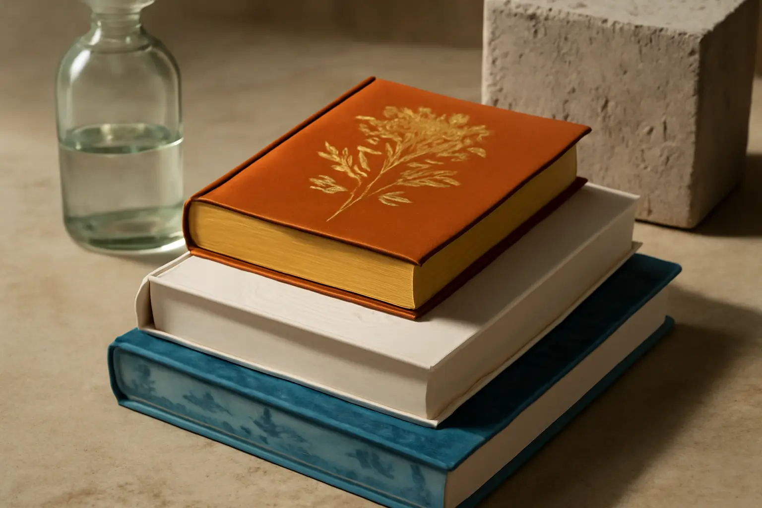
For over a decade, the digital orthodoxy whispered that physical books were a dying art form. E-readers and audiobooks were meant to sweep away the humble paper page in a tide of glossy glass and frictionless convenience. Instead, something rather wonderful happened. Readers fought back with their wallets, choosing tangible beauty over sterile efficiency. Today, independent authors and boutique presses are leading a counter-revolution, proving that the future of publishing belongs not to the screen, but to the tactile experience.
At the heart of this movement is the renaissance of print craft. No longer the exclusive domain of university presses or ultra-expensive collectors' editions, specialty finishes have become the secret weapon of the savvy indie author. We are talking about debossed covers, spot UV gloss, sprayed edges that tell a story before the book is even opened, and metallic foils that catch the light on a nightstand. This is not mere decoration; it is a declaration that a book is an object of desire.
The Death of the Plain Paperback
For too long, self-publishing bore a distinct aesthetic penalty. You could spot an indie paperback from across a convention hall by its flat matte finish, generic stock typography, and flimsy spine. Legacy houses held a monopoly on tactile luxury, pricing out the very creators driving innovation. But on-demand manufacturing and nimble independent binderies have democratised production. Savvy creators now understand that indie book design must compete with the dopamine hit of scrolling social media. If a physical book is going to command twenty pounds of hard-earned cash, it damn well better feel like an artifact.
This shift has transformed how stories are marketed. Unboxing videos and aesthetic flat-lays have turned gorgeous book designs into viral marketing engines. When an author invests in french flaps and gorgeous typography, they are buying physical word-of-mouth currency. Readers love nothing more than displaying a stunning volume on their shelves. To see how master craftsmen handle modern physical aesthetics, you might want to examine this curated guide to book production for inspiration on elevating your own catalogue.
Craft as a Shield Against Commoditization
Amazon algorithms and infinite digital shelf space have made books feel frighteningly cheap. When a novel costs ninety-nine pence on Kindle, the brain unconsciously devalues the intellectual labor behind it. Specialty finishes shatter that illusion of disposability. When you hand a reader a volume featuring heavy textured paper and gilded edges, you instantly command respect. You are telling them that this story matters, that it required blood, sweat, and meticulous attention to detail.
Legacy gatekeepers are scrambling to catch up, but they are too slow, weighed down by corporate bureaucracy and risk-averse marketing departments. The real innovation in physical books is happening at the grassroots level, driven by indie authors who treat their releases as physical events. They are collaborating with independent cover artists and boutique printers to create books that are genuinely covetable.
Stop treating your print edition as an afterthought. If you want to survive the brutal noise of the modern marketplace, elevate your physical production, embrace bold finishes, and give your readers something they can fall in love with before they even turn the first page.